
United Airlines: One Platform

01. Overview
This case study documents how over the course of 11 months I evaluated, analyzed, tested, and optimized United Airlines’ Trip Management team’s web experience.
June 2019 marked my first month on the job for United. I began by supporting our Trip Management UX lead, Beth Kettelkamp, on a large web modernization project. After Beth transitioned to a new role, I assumed responsibility for driving the team’s UX efforts as the sole designer. United Airlines had been working with Brad Frost and Josh Clark at Big Medium to build a design system that would give our website a cohesive and modern look while substantially mitigating design and technical debt. As it stood, web pages existed in three different design styles and on three different technical platforms. I worked with my team of developers, BAs, QAs, and our PM to implement this new design system across Trip Management’s workflows and pages.
Projects
Cancel path
Change path
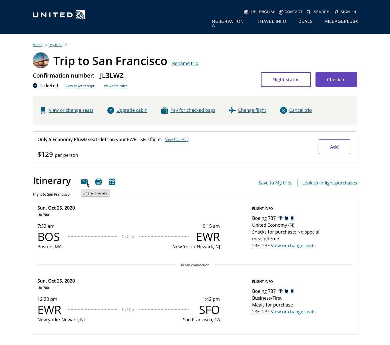
Trip details
Deliverables
Concept sketches
Mid-fidelity prototypes
High-fidelity prototypes
Concept testing
Usability testing
High-fidelity screens
Accessibility documentation
Role
Product designer (UX/UI)
Tools
Sketch
InVision
Timeframe
11 months
Problem summary
In the site’s current state, pages were using different design styles on different platforms. This lead to inefficiencies in design, development, and site maintenance, and also to a lack of consistency from the user perspective. At United Airlines, we committed to a new design system built in collaboration with Big Medium and based on the principles of atomic design to bring consistency to our platform and drive efficiency at scale. For the purposes of this case study, I will call the enterprise effort to bring consistency to our platform and design system the One Platform project.
Along the way, I had the opportunity to redesign pages that hadn’t been redesigned or replatformed since the advent of the smartphone. This meant bringing a critical eye to workflow, functionality, and information hierarchy, and bringing outdated pages and flows into a modern responsive design. Given that we know more users access the internet via a mobile device than a desktop, ensuring the website is usable on all screen sizes and device types was paramount.
The one platform project is especially important as the United mobile app doesn’t yet offer translation services or out-of-country payments. This means that the majority of non-US users rely solely on the website, no matter the device.
A note on digital accessibility
Web accessibility as a practice has evolved over the years, and some of our older pages lacked clear documentation and failed to follow best practices. We took this opportunity to enhance the accessibility of our web products. Beyond writing semantic order, I approached each screen through the lens of accessible design. I prioritized clarity, consistency, and simplicity throughout my design process, improving usability at all levels: the system, workflows, individual screens, and interactions.
Accessibility was baked into my process. I evaluated accessibility early and often, screening out concepts that proved to be inaccessible before bringing them to a higher fidelity. Incorporating accessibility early helped me more efficiently create ever more intuitive and usable interfaces. I worked closely with our UX accessibility expert, our internal digital accessibility team, and our accessibility vendor to ensure our digital experience met our high standards for all our users.
(A side note, I worked with the same team on replatforming and redesigning our mobile app too and the app was recognized with a Webby Award in no small part due to the accessibility enhancements.
The work
For each of the following three projects, I worked as the lead UX and visual designer. I leveraged existing user research and feedback to generate hypotheses for further inquiry, and I worked with our UX research team to plan, design, and analyze additional user research. Along the way I solicited input from colleagues with specialties in design systems, visual design, and accessibility. Constant feedback from diverse stakeholders and subject matter experts informed each iteration of my work so that the final product represents a collaboration of perspectives. A special shoutout to my Business Analysts, who know the United Airlines data flows like the back of their hand. Their expertise was absolutely critical.
The following section summarizes my three responsive web modernization projects, focusing on key objectives, research findings, and design solutions for:
Cancel trip workflow
Change flight workflow
Trip details page
02. Cancel trip
As of mid-2019, the Cancel trip workflow still lived in 1.0 platform and styles — our oldest web technology and design. Bringing Cancel to 3.0 (and getting it off 1.0) was an enterprise priority. Approaching the project, I set three objectives:
Design and build for mobile responsiveness.
Leverage the new componentized design system to reduce future technical debt.
Include a divide traveler feature enhancement to allow a user to cancel a trip on a multi-passenger itinerary for just one or some of the passengers.


As a first step towards redesigning the cancel path I met with Teffani, one of our team’s business analysts and the cancel path subject matter expert. Listening to Teffani, I began to understand what I came to see as our primary challenge. Cancellation transactions can get quite complex. Money can be refunded or returned in the form of a credit, miles or points are redeposited, and fees are charged. Furthermore, money might need to be refunded in different currencies, or to different forms of payment.
My interface would need to be clear and simple. It would also need to appear intuitive for straightforward and complex interactions. I hypothesized users would arrive at the cancel path with one question top of mind: “How much money am I getting back?”
To emphasize the transaction summary, I wanted to reduce the prominence of itinerary information. I conducted concept testing on 5 mid-fidelity prototypes to understand what flight information user’s needed in this context to validate they were cancelling the right itinerary. Two of these prototypes contained reduced flight information, two contained expandable flight information, and our control featured our standard flight blocks.
We learned two important things.
Users only need basic flight details. In the two prototypes with expandable details, users only expanded the information after being asked to. Upon seeing the expanded details test participants told us they didn't need all that information.
Users pay close attention to the details of their refund. The vast majority wanted to open the details and assumed there would be a detailed breakdown in this section. As our users interacted with the prototype, they wondered aloud: how many tickets are being refunded, am I getting back all my taxes and fees, is United subtracting a fee from the value of my refund?
The outcome of my concept testing strengthened my case to reduce flight details, emphasize the transaction, and include a detailed breakdown. I made some compromises in the specifics of the flight details display and the implementation of the line by line breakdown to mitigate development costs, but these areas can be monitored and iterated upon in the future as the team continues to refine the product.


03. Change flight
As the dev team started to implement the cancel path, I turned my attention to the change path (aka reshop), the only major workflow left on the 2.0 platform. This is the workflow where a user could modify their itinerary. They can add flights, remove specific flights, or fly to Hawaii instead of Boston. The reshop path reprices the users ticket based on what their itinerary was before and what they wanted now, and charges or credits that user accordingly. For efficiency’s sake, the reshop path was built on top of the code from the initial shopping path. The flight shopping process is very complex, so to keep technical debt low we leveraged the existing shopping experience and build with only minor modifications throughout the path to fit the reshop context. The only page in the path we owned in its entirety was the first page of the workflow — the Change flight page.
Because we leveraged the shopping team’s code, we also relied on the same third party data service. Functionally, this meant that the core workflow needed to conform to the same step-by-step process used for shopping: Input search criteria, pick a flight, review your trip, pick your seats, pay, confirmation. Because of the linear nature of the workflow, the user needs to enter the new search criteria for the entire itinerary before they can select any new flights.
To begin, I performed a cursory UX analysis, analyzed findings from baseline testing we conducted in 2018, and dug into google analytics to understand the change path funnel. I formed two initial hypotheses:
The existing reshop workflow requires the user to indicate all criteria for their change before seeing any flight search results. This places a high cognitive burden on the user. I hypothesized that users would want to work through the page one flight at a time. For example, users would prefer to actually select an alternative flight for the departure before even thinking about the return. Such a workflow would allow the user to focus on a single change in its entirety before considering the next.
Google analytics showed that most users abandoned on the Review trip information (RTI) screen. RTI is the first screen where users see the change fee broken out from the total price. I hypothesized that while some users simply abandoned after seeing the fee, others reached out to the call center to ask for a change fee waiver. Our digital channels are rigid and our call center is flexible — our customers know that if they call they might not have to pay as much. Every member of my product team agreed with this hypothesis.
I already knew it would be next to impossible to convince our data service to make the requisite adjustments, and it would be a massive investment to build an equivalent system. Such changes to the infrastructure were far beyond the scope of the project. Nonetheless, I felt it important to understand.
To test my hypotheses, I created 4 concepts for the initial change page, leveraging a unique interaction pattern for each concept. We tested each concept with 5 users. Because of our architecture constraints, these concepts test interaction patterns, labeling, visual presentation, and messaging, but all fit within the existing workflow. At the same time, I expected to find usability problems related to the high cognitive load this architecture demands.


Testing bore out my hypotheses.
In concept testing, users often expected to land directly onto a payments page after inputting their new search criteria, despite the fact they hadn’t yet selected any new flights. This held true even in concept two which included a stepper at the top of the page. My UX research partner and I interpreted this expectation as the consequence of a high mental load. Our test participants had taken so many actions on this page they felt they’d accomplished a lot more than they actually had. In fact, users specifically said they felt overwhelmed and wanted to complete changes one at a time instead of all together.
In my concepts, I also tested the amount of information and the volume of controls a user could have. Some concepts included a “details” show / hide, and others let users change a just a connecting flight instead of the whole flight (i.e. flight from San Francisco to Boston via Chicago, change the San Francisco to Chicago flight and keep the Chicago to Boston flight. By and large, users preferred less. In concepts with more details (2 and 4), users never indicated they wanted to see more information or clicked to do so. In concepts with more controls (3 and 4), users reported feeling overwhelmed.
I iterated based on test results and developed a prototype for usability testing. Whereas concept testing focused just on that complex change page, this second test focused on the entire workflow. I worked with the shopping team to integrate my newest design with their 3.0 designs and we conducted a joint usability study focusing on the Change flight page and the reshop path.

I reduced the volume of information from the 1.0 page, but not as much as I should have. This design also placed undue emphasis on the travelers section, which the majority of users in the change path do not interact with. While this UI brought me closer to my final iteration and usability testing helped me make these final refinements, I believe I could have better internalized and incorporated the results of the concept test into my usability testing change page iteration.
Usability testing reiterated many of the same themes from concept testing. I’d not done enough to simplify the experience and we received consistent feedback stating as much.
Our test participants also expressed frustration around transparency and cost of change fees. One user aptly noted he was already our customer — why would we have to hide the change fee from him? Unfortunately, bringing transparency to change fees would require a substantial internal policy effort above and beyond project scope. But constraints change over time and new projects are conceived every day. Now if an unexpected conversation opens the door to the possibility of more robust enhancements, my team has strong evidence documenting user expectations.
I wasn’t able to tackle the information architecture or the change fee — what I viewed as the two largest user pain points in the Change path — and I feel like I had trouble reorienting myself away from these frustrations between concept testing and usability testing. After usability testing though, I refocused towards all of the research findings we’d collected and analyzed to ensure the Change path meets user needs as best it can.


Given that our abled users experienced difficulty keeping track of all the information and each of their decisions on the change flight page, how difficult would this be for a user with cognitive impairments? Reducing cognitive load on the change page was a matter of accessibility. To start, I pared back substantially on the information available on the initial change page. I also refined labeling on controls and text throughout with the help of our UX writer. Lastly, I included descriptive text at the top of the change flight section of the page that encourages users to interact; Through research we had uncovered that many users were afraid to engage with the page, uncertain of whether or not their actions would immediately impact their itinerary.
The change path redesign was a particularly tough project for me given the complexity of the back-end system and the resultant project constraints. I struggled with how to improve a user’s comprehension of a system that in some ways doesn’t adhere to their expectations. In the end, I fell back on basic user experience principles to improve comprehension to the best of my ability. I also relied on concise and targeted on-page instructional messaging to encourage the user to explore the functionality of the page by assuring them they would have the chance to review and confirm all changes before they system made any adjustments to their itinerary.
Since completing this project, I’ve thought about what I would do differently if I could tackle it again and there’s one decision that still stands out for me. In concept testing and usability testing, we found users most often changed flights in the past due to specific circumstances. Sometimes meetings get pushed or canceled, other times a vacation is cut short by sudden responsibilities at home. In most examples we heard, users needed to adjust their plans only by hours or days. This finding led me to develop a new variation of the date picker whereby a user could toggle backwards or forwards a day with the click of a button rather than clicking into the field and selecting a new date. I got substantial pushback from the design system team around introducing this variation, and in the end I removed it from my comps and the project plan. However, upon reflection I wish I advocated more strongly for it. On a page with such high interaction cost throughout each small improvement adds up, and our user research strongly supported the utility of this small improvement.
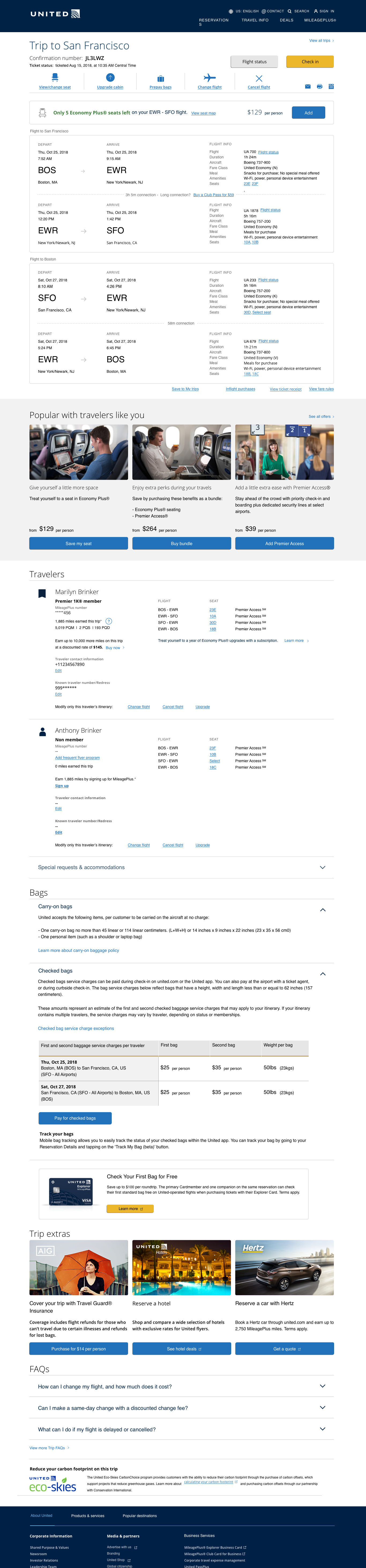
04. Trip details
After a user books a trip with United, they can access all of their itinerary information or manage their trip through our team’s flagship page: Trip details. When the team redesigned the page into our 2.0 styles, the 3.0 platform was ready. So while Trip details existed on our newest platform, it didn't leverage our new componentized design system, meaning it wouldn't benefit from those efficiencies.
View the original Trip details page in desktop viewport here and mobile viewport here.
Trip details is easily our team’s most visible page — it can receive hundreds of thousands of views per day. As such, I moved especially cautiously here, advocating for increased user testing and for A / B testing to prove out certain theories. The page contains dense information, many controls, advertisements, and product offers. In redesigning this page, I took a piece by piece approach focusing on individual sections. Because during the 2.0 redesign the team conducted a card sort to define how best to organize the sections on the page, I felt comfortable focusing on what I saw as a larger areas of opportunity.
The sole organizational objective of the Trip details redesign was to implement the design system and reap the technical benefits of a componentized system. But I knew that I had an opportunity to optimize the page at the same time. I approached each section of the page individually with two additional design goals top of mind.
Leverage common mobile-first patterns to optimize the mobile experience.
Optimize information design within sections by prioritizing only the most important information through hierarchy and the reduction of superfluous words and visuals where possible.
For the purposes of this case study, I’ll speak to my process and decision making for two sections:
The top control bar
Travelers section
The top control bar
I’d been trying to implement changes to the top control for some time before the redesign. We’d received consistently negative customer feedback around finding our utility functions (print, share, and add to calendar) for some time, which kicked off my top control bar investigation. As I watched more and more live user sessions, I found an even more disconcerting problem: users struggled to locate main page controls. Users weren’t failing task completion, but it looked like they first scrolled past the top controls and only found what they were looking for by doubling back up to the top of the page.


I brought my hypothesis to Beth to ask if she’d done any work around optimizing the top controls. As it turned out, she had. She spent a lot of time preventing them from being swapped out for primary buttons. The test and learn team, who sometimes run their own A / B tests, had previously executed a test where they changed every top control to a primary button; they estimated that the UI change would bring in millions of dollars.
But converting every persistent top control into a primary button would dilute the significance of a primary action in our design system and generate mistrust.
Their test didn’t consider any alternative concepts, and because the solution changed nearly every element of the component at the same time we couldn’t know precisely what changes were most impactful. Jason gave me the green light to develop an alternative, and asked for a strong case alongside my design as to why we chose not to execute a tested solution with such high positive monetary estimates attached.
In analyzing the existing top controls I found 3 issues:
The controls don’t look like buttons. Our design system doesn’t use this style of button anywhere else in the system. It’s uniqueness in our own system and the larger digital ecosystem means the user has no existing mental model for how this control should act.
The design emphasizes non-universal icons which eclipse the plain language button text. Additionally, by placing text beneath the icon as opposed to directly to the right the design fails to encourage users to read the label.
The control bar doesn’t stand out. The existing design fails to impart appropriate visual weight given the importance of the section. The horizontal divider line and pipes bring structure to the control bar, but don’t set the bar apart from the rest of the page.
I set a working session with the design system team to brainstorm ideas. After talking through the usability issues, we decided we wanted to use a grey band to differentiate the control bar. From there, I used our icon link component to left align controls, reduce icon size, increase text size, and underline text to further communicate interactivity. To give more space to the controls inside the band, I moved the utility controls. I added a section header above the flight information, “Itinerary”, and placed the utility functions beside the new header.

I felt confident this new solution could deliver similar monetary results while maintaining the integrity of our design system. I asked the design system team, UX research team, and the director of design to review my solution and help craft a case. I presented the case to Jason and he agreed. I suggested we test my new design to measure the financial impact before pushing the solution to production, but Jason believed it more prudent to go all in and push the change to production.
Unfortunately, Covid-19 shifted our team’s priorities away from Trip details. I was laid off soon after, before I could see this design through to production and measure the outcome.
Travelers section
Further down the page, our users could find the travelers section. Here, users could add their known traveler numbers, phone number, email address, or frequent flyer information. Jason and I identified this as a second area of opportunity. Users often told us through our in-site feedback mechanism that they couldn't find where to add a Known Traveler Number or a MileagePlus account.


Beyond tackling information display and hierarchy here, I hypothesized that I could improve the discoverability of special meals and special accommodations by incorporating these sections into each traveler’s container. Instead of needing to scroll to independent special meals and special accommodations sections, users would locate the traveler who needs the meal or accommodation and request it there. I created a prototype where entry points to special meals and accommodations lived at the individual traveler level to test against the 1:1 Atmos redesign where meals and accommodations lived in their own accordions beneath the travelers section.


My hypothesis was proven incorrect. Testing revealed that frequent United users maintained a strong mental model for where to find Special meals and Special accommodations, whereas infrequent users had no idea where to look. For infrequent users, the clarity of the independent accordions appeared to make this functionality easier to find. I integrated the findings with the improvements I’d made to the organization and display of information to support our user’s capacity to quickly find the most important information.

I maintained the Special meals and Special accommodations accordions that testing showed to be more discoverable. I organized the most important information left to right underneath the traveler name and increased the label text size to help with scannability. Because seat information already appears in the itinerary section at the top of the page, I felt comfortable hiding the seat information in a show / hide. Previously, we’d had three separate controls at the bottom of each traveler container for Upgrade cabin, Change flight, and Cancel trip; Analytics showed that users rarely leveraged these controls, and when they did 60% of the time they clicked on the Upgrade cabin link. By removing the least used controls I reduced visual clutter and cognitive load, while potentially driving more upgrades (and therefore more money) through the travelers section — a win win.
In the process of our discoverability test we uncovered something entirely unexpected. Three out of thirty users never scrolled beneath the Popular with travelers like you section. As these users struggled to find the access point to meals and accommodations they expressed frustration; “why would you put something so important underneath the ads? I really don’t think there could be anything important further down, I must be missing it.”
This finding bolstered my case for a separate initiative I’d been working on. Since October, I’d been pushing to optimize the Popular with travelers like you section by testing alternatives UI treatments to our ad-like cards. In particular, I’d been curious to see if presenting our offers more as we might present a product might reduce banner blindness and increase sales. But I never considered that the section so actively impeded page usability.

The original offer card header text is ambiguous, and the body text can be long, none of which bodes well for quick comprehension. Additionally, it’s very difficult to clearly illustrate some of these products through photos, especially product bundles which might contain two unrelated products like a better seat on the plane and a ticket to the airport lounge.
I cut down on superfluous elements and emphasized the product name, price, and a clear call to action. The photos reenforced the advertisement-esque presentation and couldn’t faithfully represent the products, so I removed them. Recognizing I took away descriptive text, I increased the prominence of the “View all” call to action to support users who need more information about product offers or want to browse. If I could make one change now, I’d change the “Add” call to action to “Learn more” to encourage users to click that call to action knowing they’d have the opportunity to review their potential purchase in more detail.

I began the process of rolling out a test and learn with my alternative UI treatment. Unfortunately our momentum and my time was cut short by the Covid-19 crisis. I handed off the test results and my designs to a colleague who I trusted to drive the implementation of these changes. While I expect my redesign to improve sales and reduce the incidence of the false bottom phenomenon, my original intention didn’t account for the false bottom. If I had more time, I would suggest testing the impact of swapping the Popular with travelers like you and the Travelers section. It’s possible that presenting users with additional offers before a critical task-oriented section of the page is actually negatively impacting sales. At the time the user sees those offers, they might be so distracted by their task they ignore a product that could be relevant to them.
05. Outcome and learnings
Our challenges are our teachers, and often present themselves as we find ourselves in new environments with new responsibilities. Previous to United, I rarely worked in high fidelity, I never worked with a design system, and I’d not yet learned to approach accessible design as a process as opposed to remediation work. I came to United to develop my hard skills and gain exposure to design systems and accessible design practice. But reflecting upon my experience, it’s clear to me I accomplished so much more than that.
As the sole and lead designer on my team for the last five months, I executed organizational objectives at the same time as I developed and pitched my own UX initiatives. I used process transparency and strategically employed inclusive design to build alignment and trust with colleagues in business verticals and technical verticals, and I very quickly learned how to adjust to technical surprises that arose throughout implementation.
I arrived at United as a design practitioner, confident in my UX know-how but having applied my skills in a limited context. I’m leaving United as a confident UX lead, capable of heading up complex organizational projects, communicating across verticals with ease, and taking a project from inception all the way through implementation.